![]()
Alain Rodriguez
TLP Dashboards for Datadog users, out of the box.
We had the pleasure to release our monitoring dashboards designed for Apache Cassandra on Datadog last week. It is a nice occasion to share our thoughts around Cassandra Dashboards design as it is a recurrent question in the community.
We wrote a post about this on the Datadog website here.
For people using Datadog we hope this will give more details on how the dashboards were designed, thus on how to use the dashboards we provided. For others, we hope this information will be useful in the process of building and then using your own dashboards, with the technology of your choice.
The Project
Building an efficient, complete, and readable set of dashboards to monitor Apache Cassandra is time consuming and far from being straightforward.
Those who tried it probably noticed it requires a fair amount of time and knowledge with both the monitoring technology in use (Datadog, Grafana, Graphite or InfluxDB, metrics-reporter, etc) and of Apache Cassandra. Creating dashboards is about picking the most relevant metrics, aggregations, units, chart type and then gather them in a way that this huge amount of data actually provides usable information. Dashboards need to be readable, understandable and easy to use for the final operator.
On one hand, creating comprehensive dashboards is a long and complex task. On the other hand, every Apache Cassandra cluster can be monitored roughly the same way. Most production issues can be detected and analyzed using a common set of charts, organized the same way, for all the Apache Cassandra clusters. Each cluster may require additional operator specific dashboards or charts depending on workload and merging of metrics outside of Cassandra, but those would supplement the standard dashboards, not replace them. There are some differences depending on the Apache Cassandra versions in use, but they are relatively minor and not subject to rapid change.
In my monitoring presentation at the 2016 Cassandra Summit I announced that we were working on this project.
In December 2017 it was release for Datadog users. If you want to get started with these dashboards and you are using Datadog, see how to do this documentation on Datadog integration for Cassandra.
Dashboard Design
Our Approach to Monitoring
The dashboards have been designed to allow the operator to do the following:
- Easily detect any anomaly (Overview Dashboard)
- Be able to efficiently troubleshoot and fix the anomaly (Themed Dashboards)
- Find the bottlenecks and optimize the overall performance (Themed Dashboards)
The 2 later points above can be seen as the same kind of operations which can be supported by the same set of dashboards.
Empowering the operator
We strongly believe that showing the metrics to the operator can be a nice entry point for learning about Cassandra. Each of the themed dashboards monitor a distinct internal processes of Cassandra. Most of the metrics related to this internal process are then grouped up within a Dashboard. We think it makes it easier for the operator to understand Cassandra’s internal processes.
To make it clearer, let’s consider the example of someone completely new to Cassandra. On first repair, the operator starts an incremental repair without knowing anything about it and latencies increase substantially after a short while. Classic.
The operator would notice a read latency in the ‘Overview Dashboard’, then aim at the ‘Read Path Dashboard’. There the operator would be able to notice that the number of SSTables went from 50 to 800 on each node, or for a table. If the chart is there out of the box, even if not knowing what an SSTable is the operator can understand something changed there and that it relates to the outage somehow. The operator would then search in the right direction, probably solving the issue quickly, and possibly learning in the process.
What to Monitor: Dashboards and Charts Detail
Here we will be really focusing on charts details and indications on how to use each chart efficiently. While this post is a discussion of dashboards available for DataDog, the metrics can be visualized using any tool, and we believe this would be a good starting point when setting up monitoring for Cassandra.
In the graphs, the values and percentiles chosen are sometime quite arbitrary and often depend on the use case or Cassandra setup. The point is to give a reference, a starting point on what could be ‘normal’ or ‘wrong’ values. The Apache Cassandra monitoring documentation, the mailing list archive, or #cassandra on #freenode (IRC) are good ways to answer questions that might pop while using dashboards.
Some dashboards are voluntary duplicated across dashboards or within a dashboard, but with distinct visualisation or aggregation.
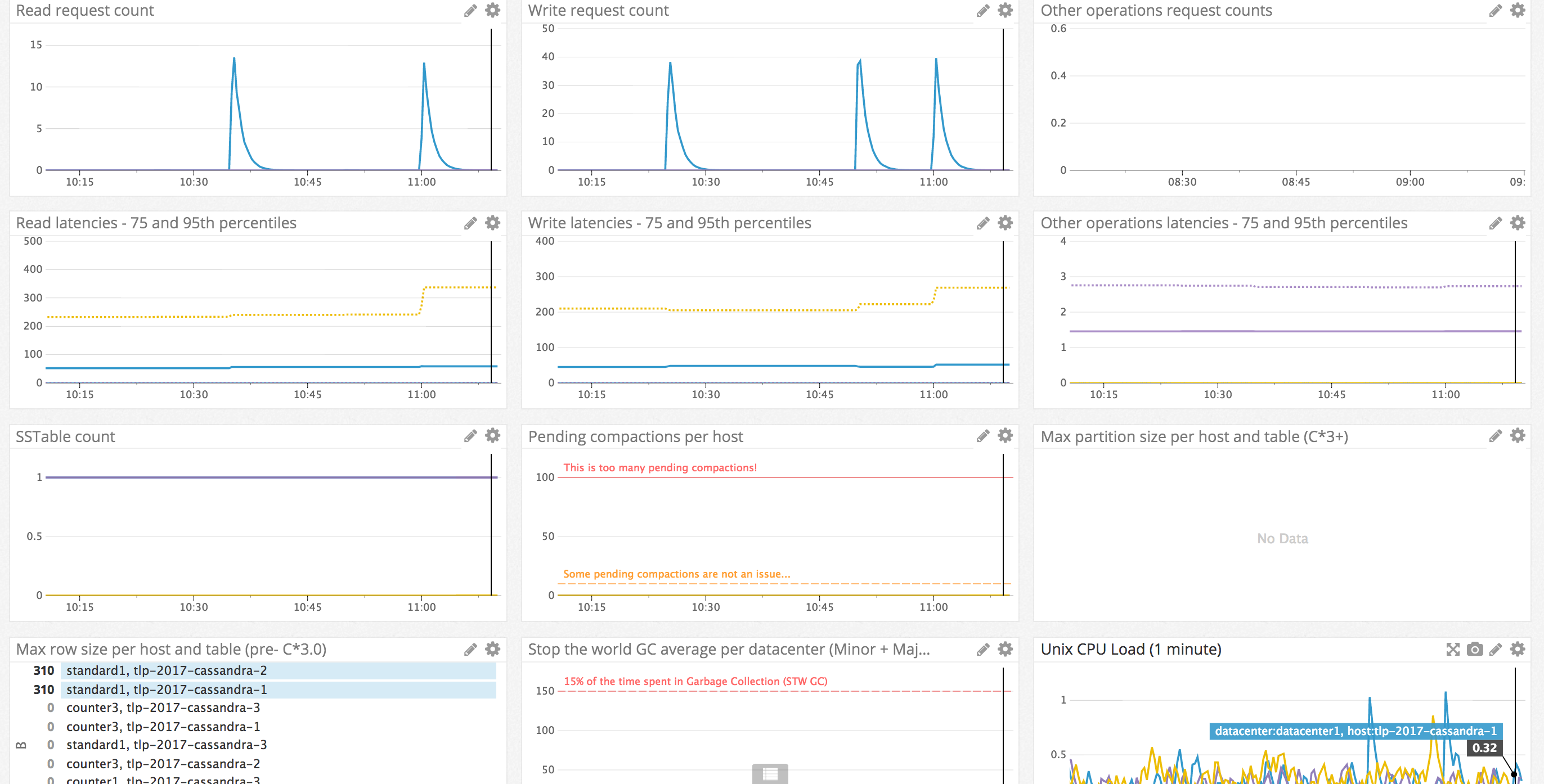
Detect anomalies: Overview Dashboard
We don’t try to troubleshoot at this stage. We want to detect outages that might impact the service or check that the Cassandra cluster is globally healthy. To accomplish this, this Overview Dashboard aims at both being complete and minimalist.
Complete as we want to be warned anytime “something is happening“ in the Cassandra cluster. Minimalist because we don’t want to miss an important information here because of the flood of non-critical or too low level informations. These charts aim answer the question: “Is Cassandra healthy?”.
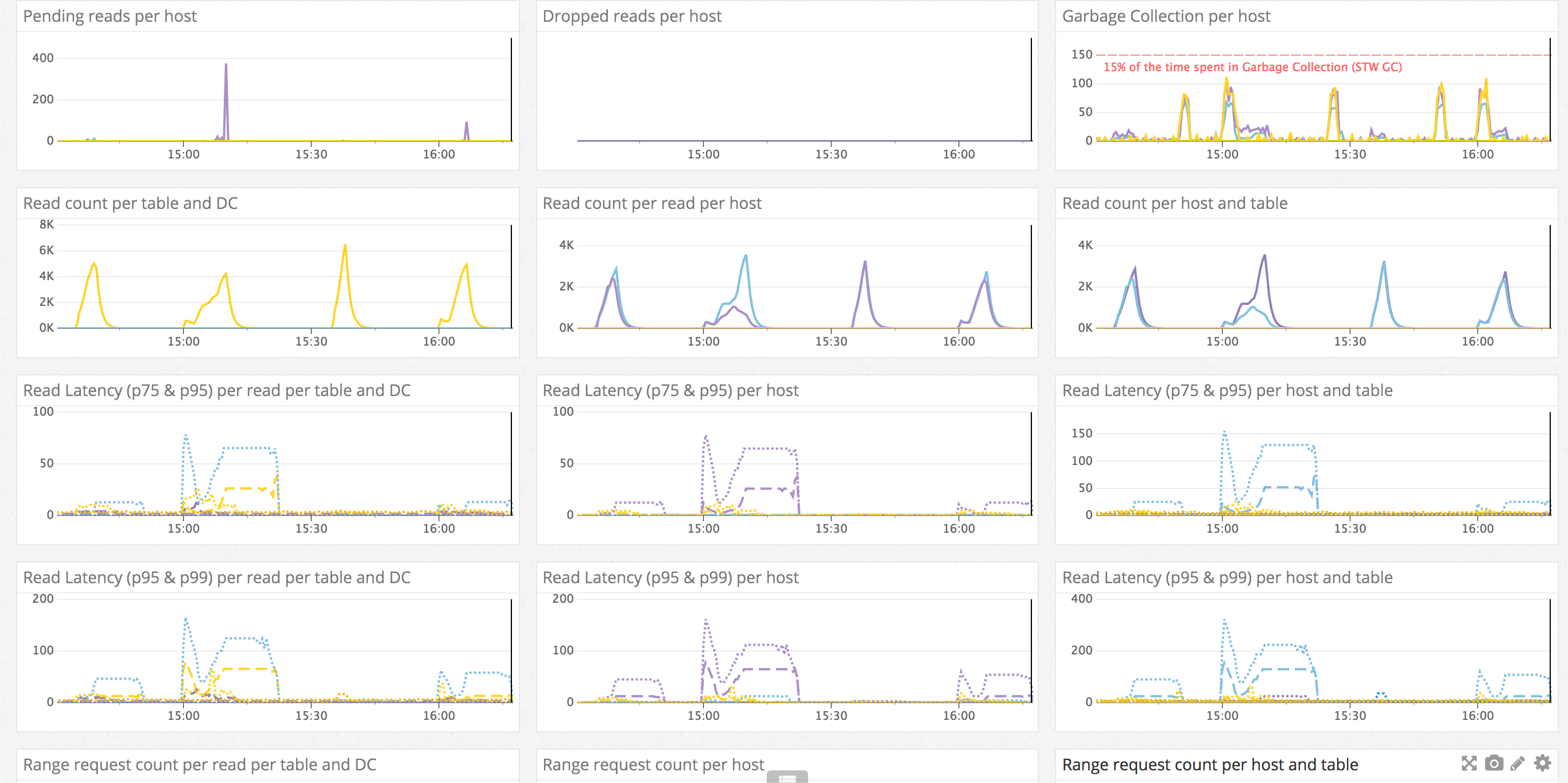
Troubleshoot issues and optimize Apache Cassandra: Themed dashboards
The goal here is to divide the information into smaller, more meaningful chunks. When having an issue, it will often only affect one of the subsystems of Cassandra, so the operator can have all the needed information in one place when working on a specific issue, without having irrelevant informations (for this specific issue) hiding more important information.
For this reason these dashboards must maximize the information on a specific theme or internal process of Cassandra and show all the low level information (per table, per host). We are often repeating charts from other dashboards, so we always find the information we need as Cassandra users. This is the contrary to the overview dashboard needs mentioned above that just shows “high level” information.
Read Path Dashboard
In this dashboard we are concerned about any element that could impact a high level client read. In fact, we want to know about everything that could affect the read path in Cassandra by just looking at this dashboard.
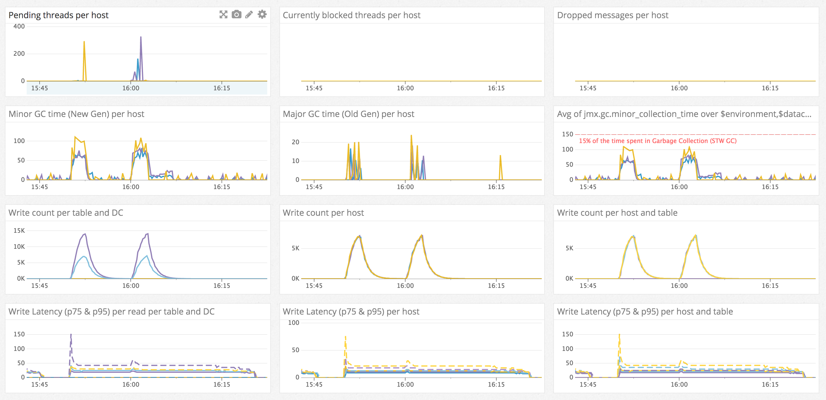
Write Path Dashboard
This dashboard focuses on a comprehensive view of the various metrics which affect write latency and throughput. Long garbage collection pause times will always result in dips in throughput and spikes in latency, so it is featured prominently on this dashboard.
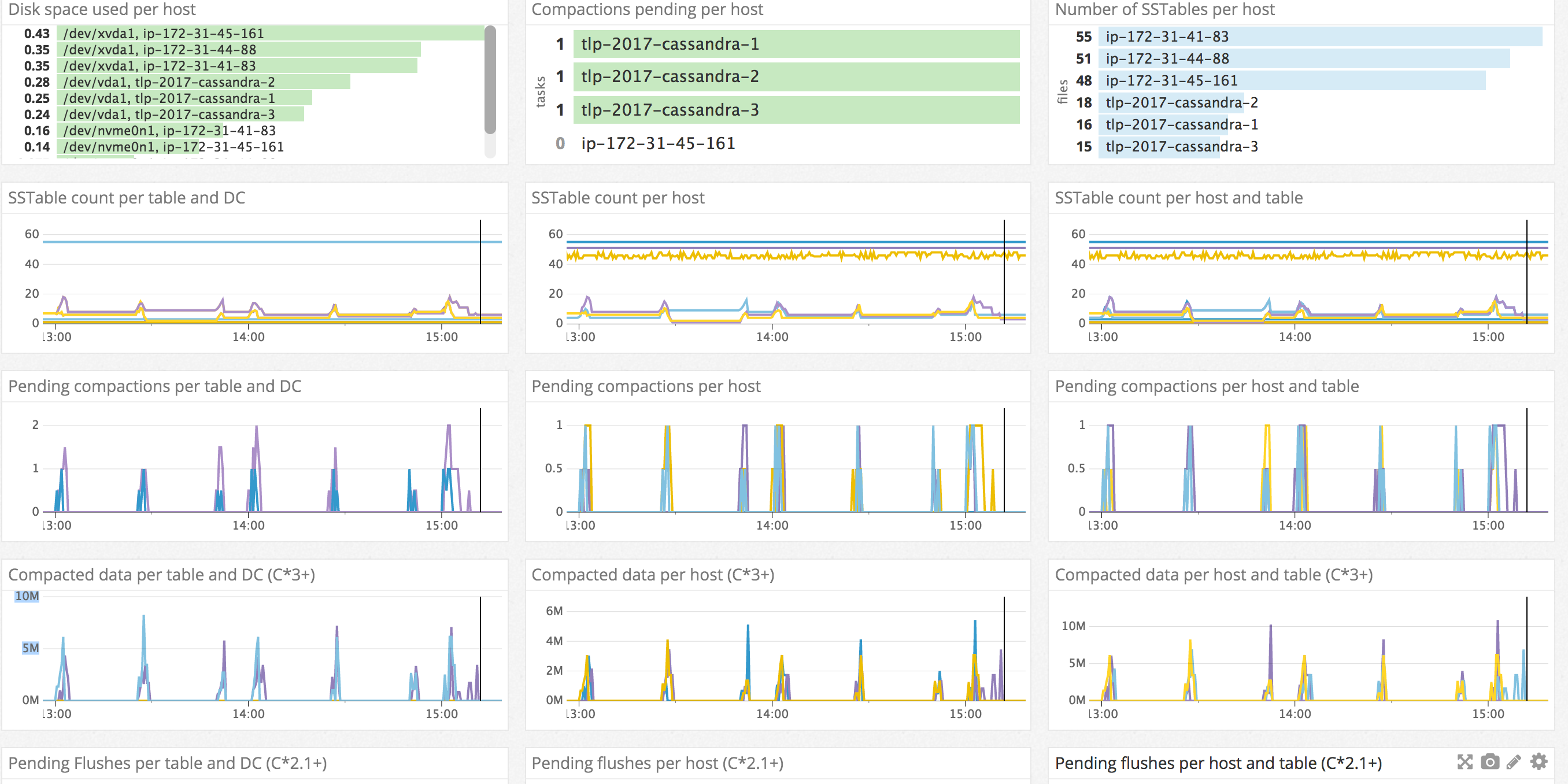
SSTable management Dashboard
This dashboard is about getting a comprehensive view of the various metrics which impact the asynchronous steps the data goes through after a write, from the flush to the data deletion with all the compaction processes in between. Here we will be willing to be aware of disk space evolution and make sure asynchronous management of SSTables is happening efficiently or as expected.
Alerting, Automated Anomaly Detection.
To conclude, when happy with monitoring dashboards, it is a good idea to add some alerting rules.
It is important to detect all the anomalies as quickly as possible. To bring monitoring to the next level of efficiency, it is good to be warned automatically when something goes wrong.
We believe adding alerts on each of the “Overview Dashboard” metrics will be sufficient to detect most issues and any major outage, or at least be a good starting point. For each metric, the alerting threshold should be high enough not to trigger false alerts to ensure a mitigating action can be taken. Some alerts should use absolute value (Disk space available, CPU, etc), while others will require relative values. Manually tuning some alerts will be required based on configuration and workload, such as alerting on the latencies.
The biggest risk on alerting is probably to be flooded by false alerts as the natural inclination to start ignoring them, which leads to missing valid ones. As a global guideline, any alert should trigger an action, if it does not, this alert is relatively useless and adds noise.